
How to Choose Your Brand Colors (and Feel Good About It)
You don’t have to guess—color is intuitive and strategic.
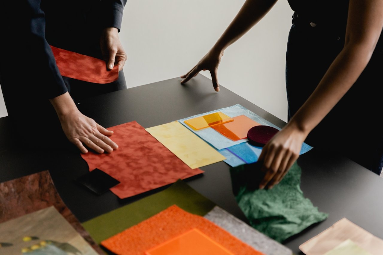
Choosing your brand colors can feel like a big decision—especially when you’re building a business as women entrepreneurs that’s meant to feel like an extension of you. But instead of overthinking or defaulting to trends, what if you approached it with a mix of intuition, and strategy?
Let’s walk through it together.
Color is Emotion and Energy
Color carries energy. It’s not just visual—it’s emotional, sensory, and even spiritual. Think of the calm of soft lavender, the groundedness of deep brown, the joy of golden yellow. The colors you choose become part of how people feel when they encounter your brand.
So instead of asking “What’s trendy?” try asking:
✨ What energy do I want my brand to radiate? Or what energy does is my target audience drawn to.
This is where your intuition gets to lead.
Warm vs. Cool Tones (and Why It Matters)
Warm tones (like peach, coral, mustard, terracotta) tend to feel cozy, inviting, and expressive.
Cool tones (like sage, periwinkle, teal, navy) feel calm, spacious, and serene.
Neither is better—they just evoke different moods. Try playing with combinations to find what feels most like home to your brand.
A good starting point:
Do you feel more drawn to warm light or cool shadows?
Does your work feel fiery and energizing, or soothing and reflective?
A Gentle Dip into Color Theory
No need to get technical—but understanding a few basics can help your palette feel harmonious:
Complementary: colors opposite each other on the color wheel (like blue + orange) bring contrast and balance.
Analogous: colors next to each other (like pink + red + coral) feel cohesive and soft.
Monochromatic: variations of the same hue (like dusty rose, blush, and deep mauve) are elegant and grounded.
Use these as starting points—not rules. Let your creative eye guide you.
Tools to Help You Visualize (and Simplify)
There are so many beautiful color palette tools out there. A few soulful favorites:
Coolors.co: Hit spacebar to shuffle palettes until one resonates.
Adobe Color: Great if you want to explore harmony rules.
Canva's color palette generator: Upload a photo you love, and it pulls colors from it.
If you’ve already started your brand style guide—this is a lovely time to plug your top colors in and see them come to life.
A Soul Check Before You Finalize
Before you commit, pause and ask:
🌿 How do I want people to feel when they land on my site?
🌿 Which colors feel like the truest expression of my essence?
🌿 Are there any colors I love that I’ve been avoiding because they’re “not professional”?
Let your answers guide you—not someone else’s mood board.
Use Your Style Guide to Bring It All Together
Once you’ve landed on your palette, it’s time to document it in your brand style guide. This will keep things cohesive across your website, social, and offers—without the decision fatigue.
💛 If you’re using the Brand Style Guide Template from Made With Sabine, head to the “Color Palette” section and start filling it in. You’ve got this.
Reflection Prompt:
🖌️ What three words describe the energy I want my brand colors to evoke?
Let those words lead your choices—and trust that beauty will follow.